Thursday, October 06, 2011
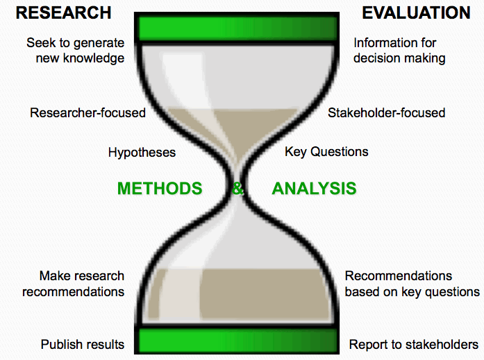
Research vs Evaluation
I found this on AEA 365 and really like the way it explains the difference between research and Evaluation
Friday, August 12, 2011

Thursday, August 04, 2011
Telephone Equipment for Evaluators
From time-to-time my consultancy conducts telephonic surveys and teleconferences as part of our normal evaluation work. I have been extremely impressed with the two South African companies that we bought our equipment from, and I want to share their contact details with you.

To give you an indication of why I was impressed - Within five minutes of contacting Phonatics about headsets, I had a quote, and it was delivered on the same day I paid for the equipment.
After losing our conference phone's manual, we emailed the general info@ email address on the Konftel website - 10 minutes later we received an emailed manual and someone called us to ensure that we got what we were looking for.
Tuesday, August 02, 2011
Knowledge Management Toolkit
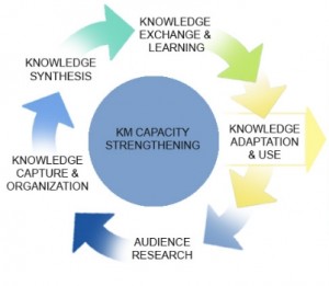
Knowledge Management for Health put this KM toolkit together that might be useful for Health Practitioners and those in the M&E field who are also concerned with ensuring that the "learning" from our evaluations do not get lost.
It will help those who are:
- Looking for a primer on KM
- Developing a KM strategy
- Interested in knowledge sharing strategies
- Interested in how to find knowledge and the best ways to organize it
- Interested in tools to create new insights and knowledge
- Interested in tools for adapting knowledge to inform and improve policy and program decision-making
- Evaluating KM activities or programmes
Thursday, July 28, 2011
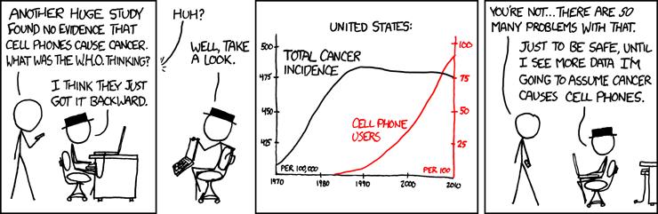
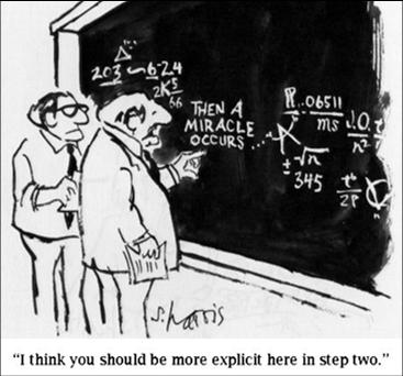
Weekly Funny: Correlation and Causation Confusion
This week's funny is again brought to you with the courtesy of xkcd. It demonstrates, quite adequately, what can go wrong in the process of interpretation of data.
Information IS (could be) beautiful!
Ooh, ooh! This is so beautiful! Information is beautiful is David McCandless' blog dedicated to beautifully executed infographics.
Here is an example they picked up from the OECD better life Initiative done by Moritz Stefaner and co.

Wednesday, July 27, 2011

Friday, July 22, 2011
Thursday, July 21, 2011
SPSS, PASW and PSPP
PSPP is a program for statistical analysis of sampled data. It is particularly suited to the analysis and manipulation of very large data sets. In addition to statistical hypothesis tests such as t-tests, analysis of variance and non-parametric tests, PSPP can also perform linear regression and is a very powerful tool for recoding and sorting of data and for calculating metrics such as skewness and kurtosis.PSPP is designed as a Free replacement for SPSS. That is to say, it behaves as experienced SPSS users would expect, and their system files and syntax files can be used in PSPP with little or no modification, and will produce similar results.
PSPP supports numeric variables and string variables up to 32767 bytes long. Variable names may be up to 255 bytes in length. There are no artificial limits on the number of variables or cases. In a few instances, the default behaviour of PSPP differs where the developers believe enhancements are desirable or it makes sense to do so, but this can be overridden by the user if desired.
I will give it a test drive an let you know what I think!
PS. to all the "pointy-heads": In the right margin of my blog you will find a link to a repository of SPSS sample syntax!
Wednesday, July 20, 2011
Using Graphs in M&E

One of my colleagues found a really simple yet detailed explanation about uses of graphs. It is written my Joseph Kelly and it is focused on financial data, but still applicable to evaluators who work with quants.
Using Graphs and Visuals
to Present Financial Information
Joseph T. Kelley
This is from the intro:
We will focus on seven widely-available graphs that are easily produced by most any electronic spreadsheet. They are column graphs, bar graphs, line graphs, area graphs, pie graphs, scatter graphs, and combination graphs. Unfortunately there is no consistency in definitions for basic graphs. One writer’s bar graph is another’s column graph, etc. For clarity we will define each as we introduce them. Traditionally we report data in written form, usually by numbers arranged in tables. A properly prepared graph can report data in a visual form. Seeing a picture of data can help managers deal with the problem of too much data and too little information. Whether the need is to inform or to persuade, graphs are an efficient way to communicate because they can
• illustrate trends not obvious in a table
• make conclusions more striking
• insure maximum impact.
Graphs can be a great help not only in the presentation of information but in the analysis of data as well. This article will focus on their use in presentations to the various audiences with which the finance analyst or manager must communicate.
Enjoy!
Monday, July 18, 2011
Recall Bias in Survey Design

Besides the fact that publications usually have a long lead time, a recall bias may also be at play. The European Health Risk Monitoring Project explains response shift bias as follow:
Recent happenings are easier to remember but when a person is asked to recall events from the past, accuracy of the recall gets worse while time span expands. Long recall periods may have a telescoping effect on the responses. This means that events further in past are telescoped into the time frame of the question.
In my example, if the question asks if a person published a journal article in the past 2 years, the respondent might place the journal article which was published 2.5 years ago into the time frame of 2 years. Those people who do not publish regularly might be better able to provide accurate information. Those who publish frequently could potentially check their facts, but they are unlikely to do so if the survey is not seen as sufficiently important.
The EHRM recommends the following strategies for trying to address this type of bias:
The process of recall of events from the past can be helped by questionnaire design and process of interview. The order of questions in the questionnaire can help respondents to recall events from the past. Also giving some landmarks (holidays, known festivals etc.) can help to remember when some events happened. Also, use of a calendar may help a respondent to set events into the correct time frame.
Friday, July 15, 2011
http://lifehacker.com/5821070/visually-is-an-infographics-hub-with-tools-to-create-your-own
http://lifehacker.com/5821070/visually-is-an-infographics-hub-with-tools-to-create-your-own
Visual.ly Is An Infographics Hub With Tools to Create Your Own
New service Visual.ly features over 2000 infographics on a range of topics from economics to history. The site also has tools to help people interested in creating their own infographics get started, build them, and share them with a community of fans and companies like CNN, National Geographic, and more.
The infographics already available at Visual.ly span topics as complicated as global arms sales to seemingly simple (but not really) topics like the overall financial impact of a snowstorm. There are plenty to see, but if you're interested in making your own, the Visual.ly Labs give you the tools to build your own, starting from templates.
For example, one of the templates allows you to compare yourself with another Twitter user, or with a Twitter celebrity. The site will add additional templates soon to help more data-driven groups present their research in interesting ways. If you're a fan of infographics, it's worth a look.
http://visual.ly/category/education

Wednesday, July 13, 2011
Resource: Reproductive Health Indicators Database
This announcement about a very useful resource came through on SAMEA talk earlier this week.

MEASURE Evaluation Population and Reproductive Health (PRH) project launches new Family Planning/Reproductive Health Indicators Database
The Family Planning/Reproductive Health Database is an updated version of the popular two-volume Compendium of Indicators for Evaluating Reproductive Health Programs (MEASURE Evaluation, 2002).
New features include:
* a menu of the most widely used indicators for evaluating family planning/reproductive health (FP/RH) programs in developing countries
* 35 technical areas with over 420 key FP/RH indicators, including definitions, data requirements, data sources, purposes and issues
* links to more than 120 Web sites and documents containing additional FP/RH indicators
This comprehensive database aims to increase the monitoring and evaluation capacity, skills and knowledge of those who plan, implement, monitor and evaluate FP/RH programs worldwide. The database is dynamic in nature, allowing indicators and narratives to be revised as research advances and programmatic priorities adapt to changing environments.
Monday, July 11, 2011
South African Consumer Databases

Today, their email carried an announcement about a new service called XtracT beta which apparently allows you to "crosstab anything against anything"
They say:
XtracT is the easiest way to access consumer information databases in South Africa. Just choose what interests you (demographics, psychographics, products, media, etc), and a filter if you wish, and a flexible cross-tabulation will appear.Details about how it works can be found on the XtracT website, and they even have a short tutorial video to explain it.
In case you wondered about their logo... This t-shirt might give you a hint!

Friday, July 08, 2011

Evaluation Basics 101 - Involve the users in the design of your instruments
Early this week, I got back from my work-related travel to Kenya, but then I ran straight into two full days of training. We planned to train the staff of a client on a new observation protocol that we developed for them to use. The new tool was based on a previous tool they had used. Before finalising the tool, we took time to discuss the tool with a small group of the staff and checked that they thought it could work. We thought the training would go well.
Drum roll...It didn't. On a scale of 0 to going well, we scored a minus 10. It felt like I had a little riot on hand when I started with "This is the new tool that we would like you to use".
Thinking about it - I should have crashed and burned in the most spectacular way. Instead, I took a moment with myself, planted a slap on my forehead, uttered a very guttural "Duh!" and mentally paged through "Evaluation Basics 101 - kindergarten version". Then I smiled, sighed, and cancelled the afternoon's training agenda. I replaced it with an activity that I introduced as: "This is the tool that we would like to workshop with you so that we can make sure that you are happy with it before you start to use it".
Some tips if ever you plan to implement a new tool (even if it is just slightly adjusted) in an organization:
1) Get everybody who will use the tool, to participate in the designing of the tool
2) Do not think that an adjustment to an already existing tool exempts you from facilitating the participatory process
3) Do not discuss the tool with only a small group from the eventual user-base. Not only will the other users who weren't consulted riot, even the ones that had their say in the small group are likely to voice their unhappiness.
When we were done, the tool looked about 80% the same as it did at the start, and they did not complain about its length, its choice of rating scale or the underlying philosophy again.
Lesson learnt. (For the second time!)
Wednesday, June 29, 2011
Weekly Funny: "A dog's brain is probably as effective...
as the most sophisticated statistical software on the market..." Says dog house diaries.
(Click for larger pic)
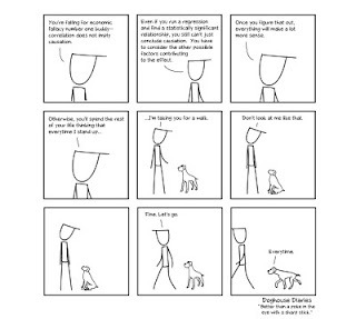
Close observations of "Spikkels" and "Trompie", my resident English Springer Spaniels, provide anecdotal evidence to support this theory. The Spaniels will have to try their tricks on the other "boss person" in our household for a few days. I'm off to East-Africa for a bit of work.
ANA Results - 2011
I have previously blogged about the implications of the Department of Basic Education's Annual National Assessments (ANAs) for educational evaluations. Yesterday, the grade 3, 6, and 9 results were released. The detailed report can be found on the FEDSAS website.
Some highlights from the Statement on the Release of the Annual National Assessments Results for 2011 by Mrs Angie Motshekga, Minister of Basic Education, Union Buildings: 28 June 2011
Read the full Statement and some reactions to this statement:
Statement by the Western Cape Education Department
News report by the Mail and Guardian Online
Statement by the largest teacher union SADTU
Statement by the official opposition
 |
| Add caption |
“Towards a delivery-driven and quality education system”Thank you for coming to this media briefing on the results of the Annual National Assessments (ANA) for 2011. These tests were written in February 2011 in the context of our concerted efforts to deliver an improved quality of basic education.
It was our intention to release the results on 29 April 2011, at the start of the new financial year, so that we could give ourselves, provinces, districts and schools ample time to analyse them carefully and take remedial steps as and where necessary. Preparing for this was a mammoth task and there were inevitable delays.
Background
We have taken an unprecedented step in the history of South Africa to test, for the very first time, nearly 6 million children on their literacy and numeracy skills in tests that have been set nationally.
This is a huge undertaking but one that is absolutely necessary to ensure we can assess what needs to be done in order to ascertain that all our learners fulfil their academic and human potential.
ANA results for 2011 inform us of many things, but in particular, that the education sector at all levels needs to focus even more on its core business – quality learning and teaching.
We’re conscious of the formidable challenges facing us. The TIMMS and PIRLS international assessments over the past decade have pointed to difficulties with the quality of literacy and numeracy in our schools.
Our own systemic assessments in 2001 and 2004 have revealed low levels of literacy and numeracy in primary schools.
The Southern and Eastern African Consortium for Monitoring Education Quality (SACMEQ) results of 2007 have shown some improvements in reading since 2003, but not in maths.
This is worrying precisely because the critical skills of literacy and numeracy are fundamental to further education and achievement in the worlds of both education and work. Many of our learners lack proper foundations in literacy and numeracy and so they struggle to progress in the system and into post-school education and training.
This is unacceptable for a nation whose democratic promise included that of education and skills development, particularly in a global world that celebrates the knowledge society and places a premium on the ability to work skilfully with words, images and numbers.
Historically, as a country and an education system, we have relied on measuring the performance of learners at the end of schooling, after twelve years. This does not allow us to comprehend deeply enough what goes on lower down in the system on a year by year basis.
Purpose of ANA
Our purpose in conducting and reporting publicly on Annual National Assessments is to continuously measure, at the primary school level, the performance of individual learners and that of classes, schools, districts, provinces and of course, of the country as a whole.
We insist on making ANA results public so that parents, schools and communities can act positively on the information, well aware of areas deserving of attention in the education of their children. The ANA results of 2011 will be our benchmark.
We will analyse and use these results to identify areas of weakness that call for improvement with regard to what learners can do and what they cannot.
For example, where assessments indicate that learners battle with fractions, we must empower our teachers to teach fractions. When our assessments show that children do not read at the level they ought to do, then we need to revisit our reading strategies.
While the ANA results inform us about individual learner performance, they also inform us about how the sector as a whole is functioning.
Going forward, ANA results will enable us to measure the impact of specific programmes and interventions to improve literacy and numeracy.
Administration of ANA
The administration of the ANA was a massive intervention. We can appreciate the scale of it when we compare the matric process involving approximately 600 000 learners with that of the ANA, which has involved nearly 6 million.
There were administrative hiccups but we will correct the stumbling blocks and continue to improve its administration.
The administration of the ANA uncovered problems within specific districts not only in terms of gaps in human and material resources, but also in terms of the support offered to schools by district officials.
ANA results for 2011
Before conducting the ANA, we said we needed to have a clear picture of the health of our public education system – positive or negative – so that we can address the weaknesses that they uncover. This we can now provide.
The results for 2011 are as follows:In Grade 3, the national average performance in Literacy, stands at 35%. In Numeracy our learners are performing at an average of 28%. Provincial performance in these two areas is between 19% and 43%, the highest being the Western Cape, and the lowest being Mpumalanga.
In Grade 6, the national average performance in Languages is 28%. For Mathematics, the average performance is 30%. Provincial performance in these two areas ranges between 20% and 41%, the highest being the Western Cape, and the lowest being Mpumalanga.
In terms of the different levels of performance, in Grade 3, 47% of learners achieved above 35% in Literacy, and 34% of learners achieved above 35% in numeracy.
In the case of Grade 6, 30% of learners achieved above 35% in Languages, and 31% of learners achieved above 35% in Mathematics.
This performance is something that we expected given the poor performance of South African learners in recent international and local assessments. But now we have our own benchmarks against which we can set targets and move forward.
Conclusion
Together we must ensure that schools work and that quality teaching and learning takes place.
We must ensure that our children attend school every day, learn how to read and write, count and calculate, reason and debate.
Working together we can do more to create a delivery-driven quality basic education system. Only this way can we bring within reach the overarching goal of an improved quality of basic education.
Improving the quality of basic education, broadening access, achieving equity in the best interest of all children are preconditions for realising South Africa’s human resources development goals and a better life for all.
I thank you.
Read the full Statement and some reactions to this statement:
Statement by the Western Cape Education Department
News report by the Mail and Guardian Online
Statement by the largest teacher union SADTU
Statement by the official opposition
Friday, June 24, 2011
Weekly Funny: Pie Charts
Pie charts are sometimes the most effective way to represent data, but sometimes, they are really useless. Dog house diaries provide an example of the latter

Thursday, June 23, 2011
Launch: June 2011 Report on the Progress In Implementing The APRM In South Africa
| Progress in implementing the APRM in South Africa Details: | ||
| Where: | Pan African Parliament - Midrand | |
| Date: | Tuesday 28 Jun 2011 -Tuesday 28 Jun 2011 | |
| Time: | 10:00 -13:00 | |
| Event description: | ||
The South African Institute of International Affairs (SAIIA), the Centre for Policy Studies (CPS) and the African Governance Monitoring and Advocacy Project (AfriMAP) will launch the South African APRM Monitoring Project (AMP) Report on Tuesday 28 June 2011 at the Pan African Parliament, 19 Richards Drive, Gallagher Estate, Midrand, commencing at 10:00am. The report is a culmination of a year-long collective effort among CSOs to jointly assess and analyse governance in South Africa. It finds that progress has been admirable in a few areas, but slow in several others. Details about the event here | ||
ICT in Education: The Threat of Implementation Failure
I am evaluating a few projects looking at the application of ICTs in Education.
![]() Although my job is to measure the learning outcomes of the projects, it seems that implementation failure is a very real risk. Projects break down even before they can be logically expected to make a difference in learning outcomes. Infrastructure problems and limited skills are some of the big threats. It seems that my projects aren't the only ones dealing with these kind of implementation challenges.
Although my job is to measure the learning outcomes of the projects, it seems that implementation failure is a very real risk. Projects break down even before they can be logically expected to make a difference in learning outcomes. Infrastructure problems and limited skills are some of the big threats. It seems that my projects aren't the only ones dealing with these kind of implementation challenges.
Greta Björk Gudmundsdottir wrote an interesting article in the open access journal: Internationl Journal of Education And Development: Using Information and Communication Technology. The article is titled:From digital divide to digital equity: Learners’ ICT competence in four primary schools in Cape Town, South Africa. It speaks to specifically computer skills which would be necessary for ICT solutions. She says:

Greta Björk Gudmundsdottir wrote an interesting article in the open access journal: Internationl Journal of Education And Development: Using Information and Communication Technology. The article is titled:From digital divide to digital equity: Learners’ ICT competence in four primary schools in Cape Town, South Africa. It speaks to specifically computer skills which would be necessary for ICT solutions. She says:
The potential of Information Communication Technologies (ICT) to enhance curriculum delivery can only be realised when the technologies have been well-appropriated in the school. This belief has led to an increase in government- or donor-funded projects aimed at providing ICTs to schools in disadvantaged communities. Previous research shows that even in cases where the technology is provided, educators are not effectively integrating such technologies in their pedagogical practices. This study aims at investigating the factors that affect the integration of ICTs in teaching and learning. The focus of this paper is on the domestication of ICTs in schools serving the disadvantaged communities in a developing country context. We employed a qualitative research approach to investigate domestication of ICT in the schools. Data for the study was gathered using in-depth interviews. Participants were drawn from randomly sampled schools in disadvantaged communities in the Western Cape. Results show that even though schools and educators appreciate the benefits of ICTs in their teaching and even though they are willing to adopt the technology, there are a number of factors that impede the integration of ICTs in teaching and learning.It would make sense to build teachers' and learners' skills to work with ICT while they are required to use ICT for learning, but this may require that the projects deliberately look at ICT skills building as part of delivering the learning solutions.
Monday, June 20, 2011
How Many Days Does it Take for Respondents to Respond to Your Survey?
At my consultancy we use SurveyMonkey for all our online survey needs. It is simple to use, reliable, and they are very responsive.
Their research and found that
![]()
The findings suggest that, under most circumstances, it would be best to wait at least seven days before starting to analyze survey responses. Sending out a reminder email after a week would probably boost the response rate somewhat.
SurveyMonkey also did some interesting analysis to answer questions like:
How Much Time are Respondents Willing to Spend on Your Survey?
Does Adding One More Question Impact Survey Completion Rate?
Go check it out!
Their research and found that
The majority of responses to surveys using an email collector were gathered in the first few days after email invitations were sent, andThe graph below maps the response rate against time.
•41% of responses were collected within 1 day
•66% of responses were collected within 3 days
•80% of responses were collected within 7 days

The findings suggest that, under most circumstances, it would be best to wait at least seven days before starting to analyze survey responses. Sending out a reminder email after a week would probably boost the response rate somewhat.
SurveyMonkey also did some interesting analysis to answer questions like:
How Much Time are Respondents Willing to Spend on Your Survey?
Does Adding One More Question Impact Survey Completion Rate?
Go check it out!
Wednesday, June 15, 2011
Weekly Funny and Free Resources
Today is Wednesday, but it is the end of my work week, hence the "funny" posted today. Tomorrow, 16 June, is youth day and since I am classified as youth (i.e. under 35 years of age) by the SA government, I am taking my youthful self to a destination slightly South and West of Pretoria for a couple of days. I will celebrate my freedom and remember those who sacrificed much. I will also watch the sun set over the sea, and eat lobster... and fish, and prawns...
Below is an illustration of how many "black box evaluations" are developed.It comes from a website dedicated to theory of change tools. Check it out!
Below is an illustration of how many "black box evaluations" are developed.It comes from a website dedicated to theory of change tools. Check it out!
Monday, June 13, 2011
The DBE's Annual National Assessments
The Department of Basic Education has started the implementation of the Annual National Assessments.

The biggest advantage of implementing the ANA, is that it supplements the information about education outcomes and quality currently in place in the Education SystemIn the DBE notice to all parents, the purpose of the ANA was explained as follow:
1) Teachers will use the individual results to inform their lessons plans and to give them a clear picture of where each individual child needs more attention, helping to build a more solid foundation for future learning. 2) The ANA will assist the Department to identify where the short comings are and intervene if a particular class or school does not perform to the national levels
It is unlikely that a single short test, administered at the beginning of each school year, will be more effective at providing feedback to teachers about the individual needs of learners, than the current assessments mandated by the DBE’s assessment policies. Continuous assessment policies already require teachers to test learners for this purpose, and if this information has not been used up and ‘til now, it is unlikely that instituting another assessment will make an impact in the school system. Rapid assessments have been shown[1] to be a very cost effective strategy for learner performance, but this requires frequent assessments and teachers with the capacity to analyse and use the results.
Assessments like these have been shown to be a useful accountability tool, depending on how the results are used[2] . It is unclear at this stage how exactly schools and teachers will be held accountable. The results will be shared with parents – which may or may not start a process where parents become more informed and involved in school quality issues. But, these results will have to be interpreted very carefully. A great teacher might produce poor literacy results because the learners in the school only started speaking the language of learning and teaching a year before. This is not a fault of the teacher… yet it might be very tempting to use it as a tool for blame. On the other hand, if the learner results show that there is a problem with a specific teacher or a specific school – How exactly will the DBE intervene? Will they have the support and the necessary information to intervene positively? Is it fair to only target maths and language teachers for “intervention” if poor numeracy and literacy results are found? Certainly, it will not benefit the Education system if the ANAs serve to antagonise the educators.
[1] Yeh, S.S. (2011). The Cost-Effectiveness of 22 Approaches for Raising Student Achievement. Information Age Publishing.
[2] Bruns, B.; Filmer D. and Patrinos, H.A. (2011). Making Schools Work. New Evidence on Accountability Reforms. Washington D.C, World Bank. Accessed online on 13 June 2011 at http://siteresources.worldbank.org/EDUCATION/Resources/278200-1298568319076/makingschoolswork.pdf
Friday, June 10, 2011
The weekly funny: Calculate the probability of a polar bear stealing your car
(Click on pic for a larger image)

Or... if you are not into bears or thieves, calculate the probability of these three intersecting:
Some people have faulty logic, some have statistical skills, and some have no life.
Or... if you are not into bears or thieves, calculate the probability of these three intersecting:
Some people have faulty logic, some have statistical skills, and some have no life.
Thursday, June 09, 2011
The theory behind Sensemaker
Yesterday I posted about Sensemaker. A discussion on the SAMEA listserve ensued. Kevin Kelly posted this:
The software (sense maker) is founded on a conceptual framework grounded in the work of Cognitive Edge (David Snowden). The software is very innovative, but not something that one can simply upload and start using. One really needs to grasp the conceptual background first. It should also be noted that the undergirding conceptual framework (Cynefin) is not specifically oriented to evaluation practice, and is developed more as a set of organisational and information management practices. I am hoping to run a one-day workshop at the SAMEA conference which looks at the use of complexity and systems concepts, and which will outline the Cynefin framework and explore its relevance and value for M&E.

In case someone else is interested in reading up about specifically cynefin and more general complexity concepts I share some resource (with descriptions from publisher's websites)
- Bob Williams and Hummelbrunner (Authors of the book Systems Concepts in Action: A practitioner’s Toolkit ) presented a work session at the November 2010 AEA conference where he introduced some systems tools as it relates to the evaluator’s practice
Systems Concepts in Action: A Practitioner's Toolkit explores the application of systems ideas to investigate, evaluate, and intervene in complex and messy situations. The text serves as a field guide, with each chapter representing a method for describing and analyzing; learning about; or changing and managing a challenge or set of problems. The book is the first to cover in detail such a wide range of methods from so many different parts of the systems field. The book's Introduction gives an overview of systems thinking, its origins, and its major subfields. In addition, the introductory text to each of the book's three parts provides background information on the selected methods. Systems Concepts in Action may serve as a workbook, offering a selection of tools that readers can use immediately. The approaches presented can also be investigated more profoundly, using the recommended readings provided. While these methods are not intended to serve as "recipes," they do serve as a menu of options from which to choose. Readers are invited to combine these instruments in a creative manner in order to assemble a mix that is appropriate for their own strategic needs.
- Another good reference about Systems concepts I found was Johnny Morrell’s Book – Evaluation in the Face of Uncertainty.
His description about the book is here
- And then Patton’s latest text (Developmental Evaluation – Applying Complexity Concepts to Enhance Innovation) also touches on complexity issues and Cynefin .
Developmental evaluation (DE) offers a powerful approach to monitoring and supporting social innovations by working in partnership with program decision makers. In this book, eminent authority Michael Quinn Patton shows how to conduct evaluations within a DE framework. Patton draws on insights about complex dynamic systems, uncertainty, nonlinearity, and emergence. He illustrates how DE can be used for a range of purposes: ongoing program development, adapting effective principles of practice to local contexts, generating innovations and taking them to scale, and facilitating rapid response in crisis situations. Students and practicing evaluators will appreciate the book's extensive case examples and stories, cartoons, clear writing style, "closer look" sidebars, and summary tables. Provided is essential guidance for making evaluations useful, practical, and credible in support of social change.
- Rogers also published a nice article in 2008 in the Journal Evaluation about this

This article proposes ways to use programme theory for evaluating aspects of programmes that are complicated or complex. It argues that there are useful distinctions to be drawn between aspects that are complicated and those that are complex, and provides examples of programme theory evaluations that have usefully represented and address both of these. While complexity has been defined in varied ways in previous discussions of evaluation theory and practice, this article draws on Glouberman and Zimmerman's conceptualization of the differences between what is complicated (multiple components) and what is complex (emergent). Complicated programme theory may be used to represent interventions with multiple components, multiple agencies, multiple simultaneous causal strands and/or multiple alternative causal strands. Complex programme theory may be used to represent recursive causality (with reinforcing loops), disproportionate relationships (where at critical levels, a small change can make a big difference — a `tipping point') and emergent outcomes.
For more resources, try AEA 365
Wednesday, June 08, 2011
Sense Maker
In a previous post, I ventured that we should start questioning the archaic. Our methods and our ways of communicating results haven't changed much over the past 10 years or so, despite new technologies and preferences.
I have posted a number of examples of interesting data visualizations, but the clip below introduces a new way of collecting information, with the help of a product called Sensemaker.
Here Irene Guijt talks about Sensemaker in the context of Evaluation.
Here is an article in the Stanford Social Innovation Review about a real life application done by Global Giving.
Monday, June 06, 2011
Data Visualization: Museum of Me
Presentation of information is important to anyone that wants to make an impact with what they say. Intel dreamed up another interesting way of presenting different kinds of information.

If you have a facebook profile (and you don't mind intel punting their product a bit), why not take a walk in your own museum of you? The "Museum of Me" compiles all your Facebook information and creates a three-minute long expose about you. It could be scary... In the same way as listening to your own recorded voice could be scary. Gizmodo says that this is a reminder why you should'nt be using facebook!
If you have a facebook profile (and you don't mind intel punting their product a bit), why not take a walk in your own museum of you? The "Museum of Me" compiles all your Facebook information and creates a three-minute long expose about you. It could be scary... In the same way as listening to your own recorded voice could be scary. Gizmodo says that this is a reminder why you should'nt be using facebook!
Friday, June 03, 2011
Survey answers when you ask people to state the obvious
You run a survey and you ask two questions which should have fairly straightforward answers:
Question 1: Are you Male / Female?
Question 2: What Colour is this?
The following comic from doghouse diaries, and the results of an actual colour survey at xkcd tells you a little about the validity of surveys...


Thursday, June 02, 2011
Evaluation Tasks
I found this graphical representation of Evaluation Tasks from Better Evaluation very useful for thinking about the evaluation process.

(Click on the pic for a larger version).
(Click on the pic for a larger version).
In my experience the "synthesize findings across evaluations"-bit gets neglected. In my work as an evaluator contracted to many corporate donors, I am usually required to submit an evaluation report for use by the client. I often have to sign a confidentiality agreement that prohibits me from doing any formal synthesis and sharing, even if I am doing similar work for different clients. Informally, I do share from my experience, but the communication is based on my anecdotal retellings of evidence that has been integrated in a very patchy manner.I try to push and prod clients into talking to each other about common issues, but this rarely results in a formal synthesis.
It is not always feasible for the clients who commission evaluations to do this kind of synthesis. Their in-house evaluation capacity rarely includes the meta-analysis skill, and even if they contract a consultant to conduct a meta-analysis based on a variety of their own evaluations, there are some problems: Aggregating findings from a range of evaluations that do not pay attention to the possibility that a meta-analysis will be done somewhere in the future, requires a bit of a “fruit-salad approach” where apples and oranges, and even some peas and radishes, are thrown together. Another obvious problem is that donors who do not care to share the good, bad and ugly of their programs with the entire world, would be hesitant to make their evaluations available for a meta-analysis conducted by another donor.
Perhaps we require a “harmonization” effort among the corporate donors working in the same area?
Subscribe to:
Posts (Atom)