Thursday, July 28, 2011
Weekly Funny: Correlation and Causation Confusion
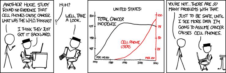
This week's funny is again brought to you with the courtesy of xkcd. It demonstrates, quite adequately, what can go wrong in the process of interpretation of data.
Information IS (could be) beautiful!
Ooh, ooh! This is so beautiful! Information is beautiful is David McCandless' blog dedicated to beautifully executed infographics.
Here is an example they picked up from the OECD better life Initiative done by Moritz Stefaner and co.

Wednesday, July 27, 2011

Friday, July 22, 2011
Thursday, July 21, 2011
SPSS, PASW and PSPP
PSPP is a program for statistical analysis of sampled data. It is particularly suited to the analysis and manipulation of very large data sets. In addition to statistical hypothesis tests such as t-tests, analysis of variance and non-parametric tests, PSPP can also perform linear regression and is a very powerful tool for recoding and sorting of data and for calculating metrics such as skewness and kurtosis.PSPP is designed as a Free replacement for SPSS. That is to say, it behaves as experienced SPSS users would expect, and their system files and syntax files can be used in PSPP with little or no modification, and will produce similar results.
PSPP supports numeric variables and string variables up to 32767 bytes long. Variable names may be up to 255 bytes in length. There are no artificial limits on the number of variables or cases. In a few instances, the default behaviour of PSPP differs where the developers believe enhancements are desirable or it makes sense to do so, but this can be overridden by the user if desired.
I will give it a test drive an let you know what I think!
PS. to all the "pointy-heads": In the right margin of my blog you will find a link to a repository of SPSS sample syntax!
Wednesday, July 20, 2011
Using Graphs in M&E

One of my colleagues found a really simple yet detailed explanation about uses of graphs. It is written my Joseph Kelly and it is focused on financial data, but still applicable to evaluators who work with quants.
Using Graphs and Visuals
to Present Financial Information
Joseph T. Kelley
This is from the intro:
We will focus on seven widely-available graphs that are easily produced by most any electronic spreadsheet. They are column graphs, bar graphs, line graphs, area graphs, pie graphs, scatter graphs, and combination graphs. Unfortunately there is no consistency in definitions for basic graphs. One writer’s bar graph is another’s column graph, etc. For clarity we will define each as we introduce them. Traditionally we report data in written form, usually by numbers arranged in tables. A properly prepared graph can report data in a visual form. Seeing a picture of data can help managers deal with the problem of too much data and too little information. Whether the need is to inform or to persuade, graphs are an efficient way to communicate because they can
• illustrate trends not obvious in a table
• make conclusions more striking
• insure maximum impact.
Graphs can be a great help not only in the presentation of information but in the analysis of data as well. This article will focus on their use in presentations to the various audiences with which the finance analyst or manager must communicate.
Enjoy!
Monday, July 18, 2011
Recall Bias in Survey Design

Besides the fact that publications usually have a long lead time, a recall bias may also be at play. The European Health Risk Monitoring Project explains response shift bias as follow:
Recent happenings are easier to remember but when a person is asked to recall events from the past, accuracy of the recall gets worse while time span expands. Long recall periods may have a telescoping effect on the responses. This means that events further in past are telescoped into the time frame of the question.
In my example, if the question asks if a person published a journal article in the past 2 years, the respondent might place the journal article which was published 2.5 years ago into the time frame of 2 years. Those people who do not publish regularly might be better able to provide accurate information. Those who publish frequently could potentially check their facts, but they are unlikely to do so if the survey is not seen as sufficiently important.
The EHRM recommends the following strategies for trying to address this type of bias:
The process of recall of events from the past can be helped by questionnaire design and process of interview. The order of questions in the questionnaire can help respondents to recall events from the past. Also giving some landmarks (holidays, known festivals etc.) can help to remember when some events happened. Also, use of a calendar may help a respondent to set events into the correct time frame.
Friday, July 15, 2011
http://lifehacker.com/5821070/visually-is-an-infographics-hub-with-tools-to-create-your-own
http://lifehacker.com/5821070/visually-is-an-infographics-hub-with-tools-to-create-your-own
Visual.ly Is An Infographics Hub With Tools to Create Your Own
New service Visual.ly features over 2000 infographics on a range of topics from economics to history. The site also has tools to help people interested in creating their own infographics get started, build them, and share them with a community of fans and companies like CNN, National Geographic, and more.
The infographics already available at Visual.ly span topics as complicated as global arms sales to seemingly simple (but not really) topics like the overall financial impact of a snowstorm. There are plenty to see, but if you're interested in making your own, the Visual.ly Labs give you the tools to build your own, starting from templates.
For example, one of the templates allows you to compare yourself with another Twitter user, or with a Twitter celebrity. The site will add additional templates soon to help more data-driven groups present their research in interesting ways. If you're a fan of infographics, it's worth a look.
http://visual.ly/category/education

Wednesday, July 13, 2011
Resource: Reproductive Health Indicators Database
This announcement about a very useful resource came through on SAMEA talk earlier this week.

MEASURE Evaluation Population and Reproductive Health (PRH) project launches new Family Planning/Reproductive Health Indicators Database
The Family Planning/Reproductive Health Database is an updated version of the popular two-volume Compendium of Indicators for Evaluating Reproductive Health Programs (MEASURE Evaluation, 2002).
New features include:
* a menu of the most widely used indicators for evaluating family planning/reproductive health (FP/RH) programs in developing countries
* 35 technical areas with over 420 key FP/RH indicators, including definitions, data requirements, data sources, purposes and issues
* links to more than 120 Web sites and documents containing additional FP/RH indicators
This comprehensive database aims to increase the monitoring and evaluation capacity, skills and knowledge of those who plan, implement, monitor and evaluate FP/RH programs worldwide. The database is dynamic in nature, allowing indicators and narratives to be revised as research advances and programmatic priorities adapt to changing environments.
Monday, July 11, 2011
South African Consumer Databases

Today, their email carried an announcement about a new service called XtracT beta which apparently allows you to "crosstab anything against anything"
They say:
XtracT is the easiest way to access consumer information databases in South Africa. Just choose what interests you (demographics, psychographics, products, media, etc), and a filter if you wish, and a flexible cross-tabulation will appear.Details about how it works can be found on the XtracT website, and they even have a short tutorial video to explain it.
In case you wondered about their logo... This t-shirt might give you a hint!

Friday, July 08, 2011

Evaluation Basics 101 - Involve the users in the design of your instruments
Early this week, I got back from my work-related travel to Kenya, but then I ran straight into two full days of training. We planned to train the staff of a client on a new observation protocol that we developed for them to use. The new tool was based on a previous tool they had used. Before finalising the tool, we took time to discuss the tool with a small group of the staff and checked that they thought it could work. We thought the training would go well.
Drum roll...It didn't. On a scale of 0 to going well, we scored a minus 10. It felt like I had a little riot on hand when I started with "This is the new tool that we would like you to use".
Thinking about it - I should have crashed and burned in the most spectacular way. Instead, I took a moment with myself, planted a slap on my forehead, uttered a very guttural "Duh!" and mentally paged through "Evaluation Basics 101 - kindergarten version". Then I smiled, sighed, and cancelled the afternoon's training agenda. I replaced it with an activity that I introduced as: "This is the tool that we would like to workshop with you so that we can make sure that you are happy with it before you start to use it".
Some tips if ever you plan to implement a new tool (even if it is just slightly adjusted) in an organization:
1) Get everybody who will use the tool, to participate in the designing of the tool
2) Do not think that an adjustment to an already existing tool exempts you from facilitating the participatory process
3) Do not discuss the tool with only a small group from the eventual user-base. Not only will the other users who weren't consulted riot, even the ones that had their say in the small group are likely to voice their unhappiness.
When we were done, the tool looked about 80% the same as it did at the start, and they did not complain about its length, its choice of rating scale or the underlying philosophy again.
Lesson learnt. (For the second time!)
Subscribe to:
Posts (Atom)